Arrival Analytics
Arrival Analytics is the charts view of your on-time arrival data. It answers "how are we doing, and where should I look first" — which schools, groups, and vehicles are running late or missing arrivals.
Who uses this: transportation operations and district administrators.
Where to find it
Go to Analytics & Reports in the sidebar, open the On-Time Arrival tile, then choose Arrival Analytics.
For the same data as a table you can sort and export, see the On-Time Arrival Report.
Load the dashboard
- Pick a date range, or use a preset — Today, Yesterday, This Week, Last Week, Last 30 Days.
- Select Load Report.
- Switch the Data / Dashboard toggle to Dashboard.
Loading clears any filters you had set. Both views share the same loaded data, so you can flip between the charts and the table without reloading.
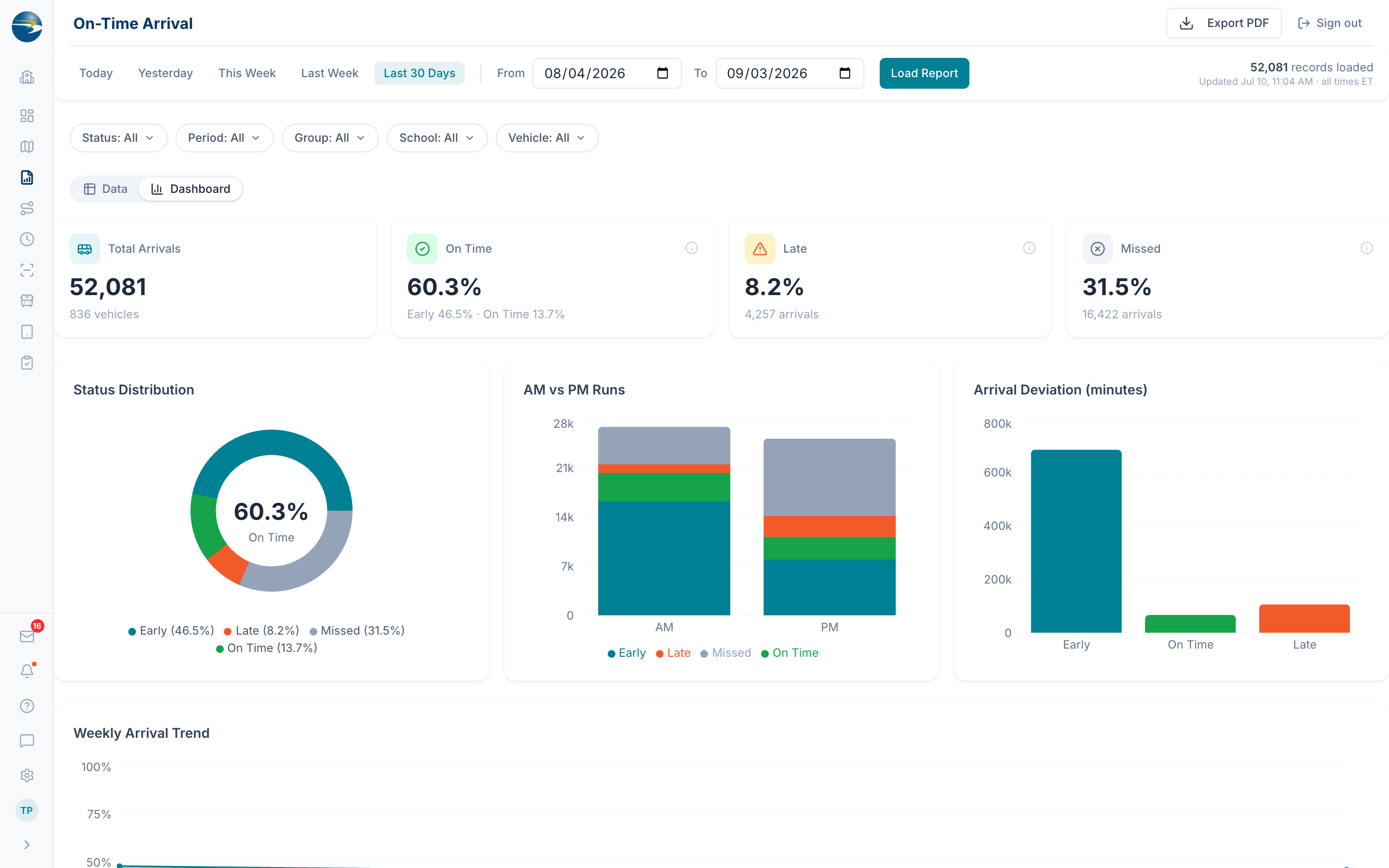 The Arrival Analytics dashboard.
The four cards at the top
| Card | What it tells you |
|---|---|
| Total Arrivals | How many arrivals are in the period, and how many vehicles they came from |
| On Time | Early and on-time combined, with each broken out underneath |
| Late | The percentage and count arriving after the bell |
| Missed | The percentage and count with no arrival recorded |
Note
Filtering Missed out of the Status chip changes what every percentage is measured against — it switches to "of the buses that actually arrived, this many were on time." The Total Arrivals card says so when this happens, so you always know which denominator you're reading.
The charts
| Chart | What it shows |
|---|---|
| Status Distribution | The Early / On Time / Late / Missed mix, with on-time % in the middle |
| AM vs PM Runs | Whether your problem is morning, afternoon, or both |
| Arrival Deviation | How many minutes early or late, by category |
| Arrival Trend | On-time performance over time |
| Arrival Rate by Group | The status mix for each group |
| School Arrival Detail | A sortable table per school |
| Schools Needing Attention | Schools ranked by late plus missed |
| Vehicles Needing Attention | Vehicles ranked by late plus missed |
Click a chart to filter
Clicking a slice, bar, or row filters the whole dashboard to that value and dims the rest. Click it again to clear. It's the quickest way to go from "late arrivals are up" to "late arrivals are up at these two schools".
The Arrival Trend chart picks its own time buckets to suit the range: daily up to two weeks, weekly up to three months, monthly up to a year, quarterly beyond that.
Filter it down
Filter by Status, Period (AM, PM, MID), Group, School, and Vehicle, all multi-select. A "Showing X of Y arrivals" line and Clear All appear when a filter is on.
Note
As on the tabular report, the Group and Vehicle options come from the arrivals in the period you loaded, not from your district's current list.
Good to know
- The two "Needing Attention" tables and the by-group chart only count things with at least 20 arrivals in the period. A vehicle with two arrivals, both late, would read as 100% late and sit misleadingly at the top, so it's left out.
- The legend pins down the on-time thresholds and the average deviation for the period you're looking at.
- Arrivals still appear correctly even if the route, vehicle, or group has since been deleted.
- Export PDF captures the charts as you see them. Switch to Data and the button becomes Export CSV for the underlying rows — see the On-Time Arrival Report.